Günter Fruhtrunk
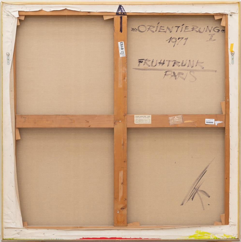
„Orientierung II“
Artist
Günter Fruhtrunk
Ausstellung
Fruhtrunk, Galerie Denise René, Paris 1974, s/w-Abb. o.P ;
Günter Fruhtrunk, Agitation. Ausgewählte Gemälde und Grafiken, Grisebach GmbH (Hrsg.) Berlin 2017, Kat.-Nr. 5, farb.Abb.
Günter Fruhtrunk, Agitation. Ausgewählte Gemälde und Grafiken, Grisebach GmbH (Hrsg.) Berlin 2017, Kat.-Nr. 5, farb.Abb.
Provenance
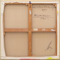
Galerie Denise René, Paris, verso auf dem Keilrahmen mit dem Etikett;
Kunsthaus Dr. Erich Steinfels Auktionen, Zürich 17.4.1980, Los 78;
Sammlung Branco Weiss, Zollikon;
Sotheby's, London 18.10.2013, Los 153;
Ketterer Kunst, München 10.12.2016, Los 844;
Privatsammlung, Hessen;
Privatbesitz, Frankfurt/Main.
Kunsthaus Dr. Erich Steinfels Auktionen, Zürich 17.4.1980, Los 78;
Sammlung Branco Weiss, Zollikon;
Sotheby's, London 18.10.2013, Los 153;
Ketterer Kunst, München 10.12.2016, Los 844;
Privatsammlung, Hessen;
Privatbesitz, Frankfurt/Main.
Share
Description
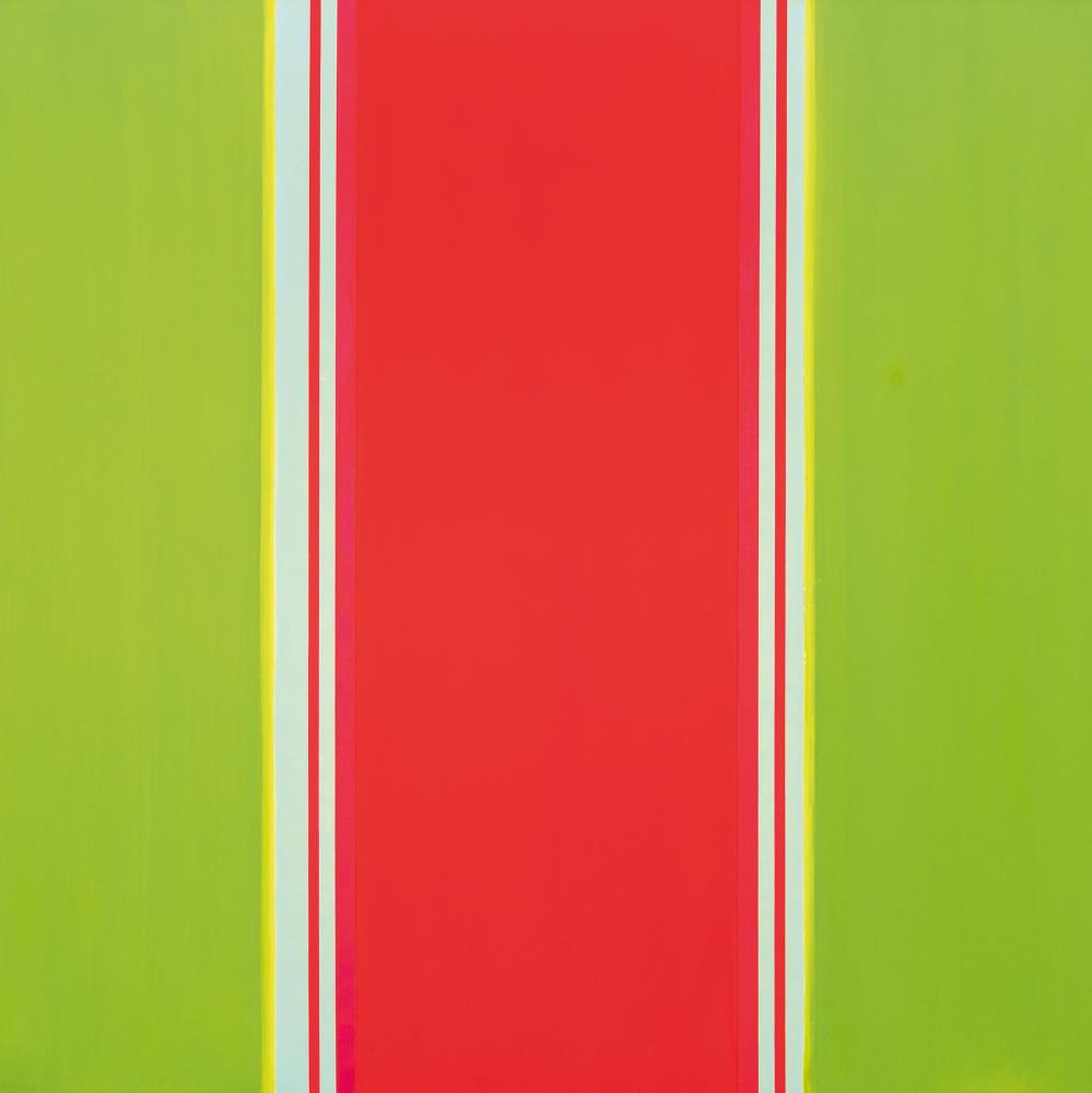
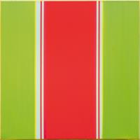
- Günter Fruhtrunk's paintings from the early 1970s are icons of Concrete Art
- Balanced, large-format composition with overwhelming radiance in the complementary colors red and green
- The Lenbachhaus in Munich, the Kunstmuseum Bonn and the Museum Wiesbaden have dedicated comprehensive exhibitions to Fruhtrunk on the occasion of his 100th birthday in 2024. His works can be found in all major collections of Concrete Art
Günter Fruhtrunk is one of the most important representatives of Concrete Art. He spent the most important years of his artistic development between 1954 and 1967 in Paris, where he found his own style. He had already met Willy Baumeister and Julius Bissier at the end of the 1940s and his turn towards non-objective art had begun. Mentally and physically wounded by the experiences of the Second World War, Fruhtrunk saw abstraction as pointing the way forward, linked to the hope of a universal artistic language that would transcend all national boundaries. In Paris, the young artist sought to join the international avant-garde. He was supported in this by Sonia Delaunay and Hans Arp, who had already championed geometric abstraction in the 1930s as part of the Abstraction-Création artists' association. The hub of the network was the well-known gallery owner Denise René. She exhibited Günter Fruhtrunk for the first time in 1957, thereby establishing the artist's success. The Paris years are characterized by the increasing complexity of the compositions. The painter leaves all narrative and subjectivity behind. He created pictorial structures that set the tone for his entire later work: complex compositions imbued with clarity that radiate beauty and tranquillity thanks to their harmonious inner order. The works from the 1970s are icons of Concrete Art. In the present composition, Günter Fruhtrunk has created a balanced work with overwhelming radiance. It consists of monochrome color fields in red and green, merging at the edges into fine stripes with delicate color gradients, interrupted and separated from each other by white stripes that reinforce the concept.
Rider 662.